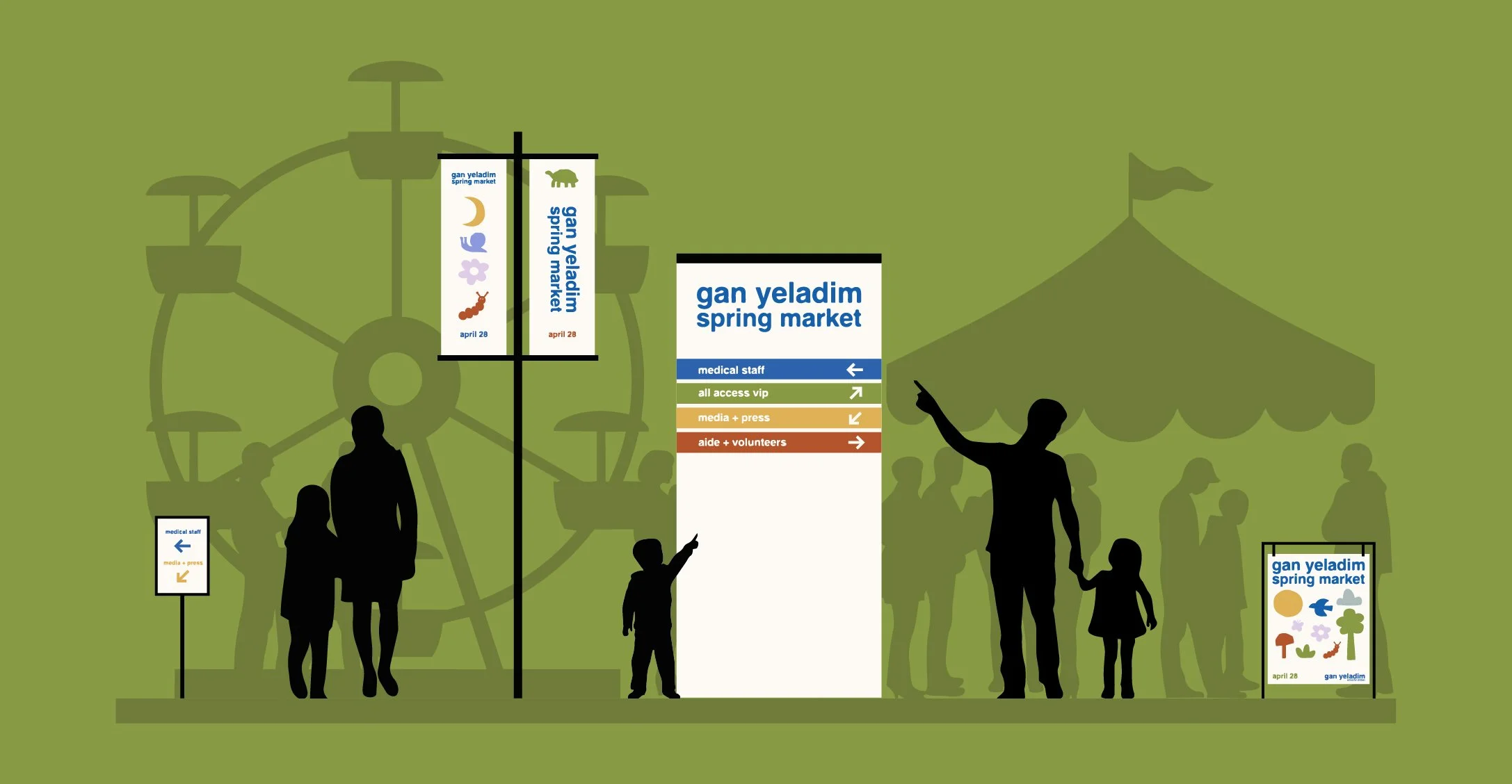
Gan Yeladim Spring Market
The conceptual art direction campaign for Gan Yeladim School for Children’s spring market, exploring experiential graphic design via large format print, out of home marketing, wayfinding components and merchandise.

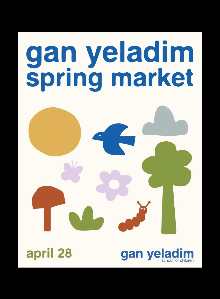
The campaign’s art direction embodies the energy of childhood through a vibrant and playful visual language of bold color combinations, simplified typography and whimsical motifs.
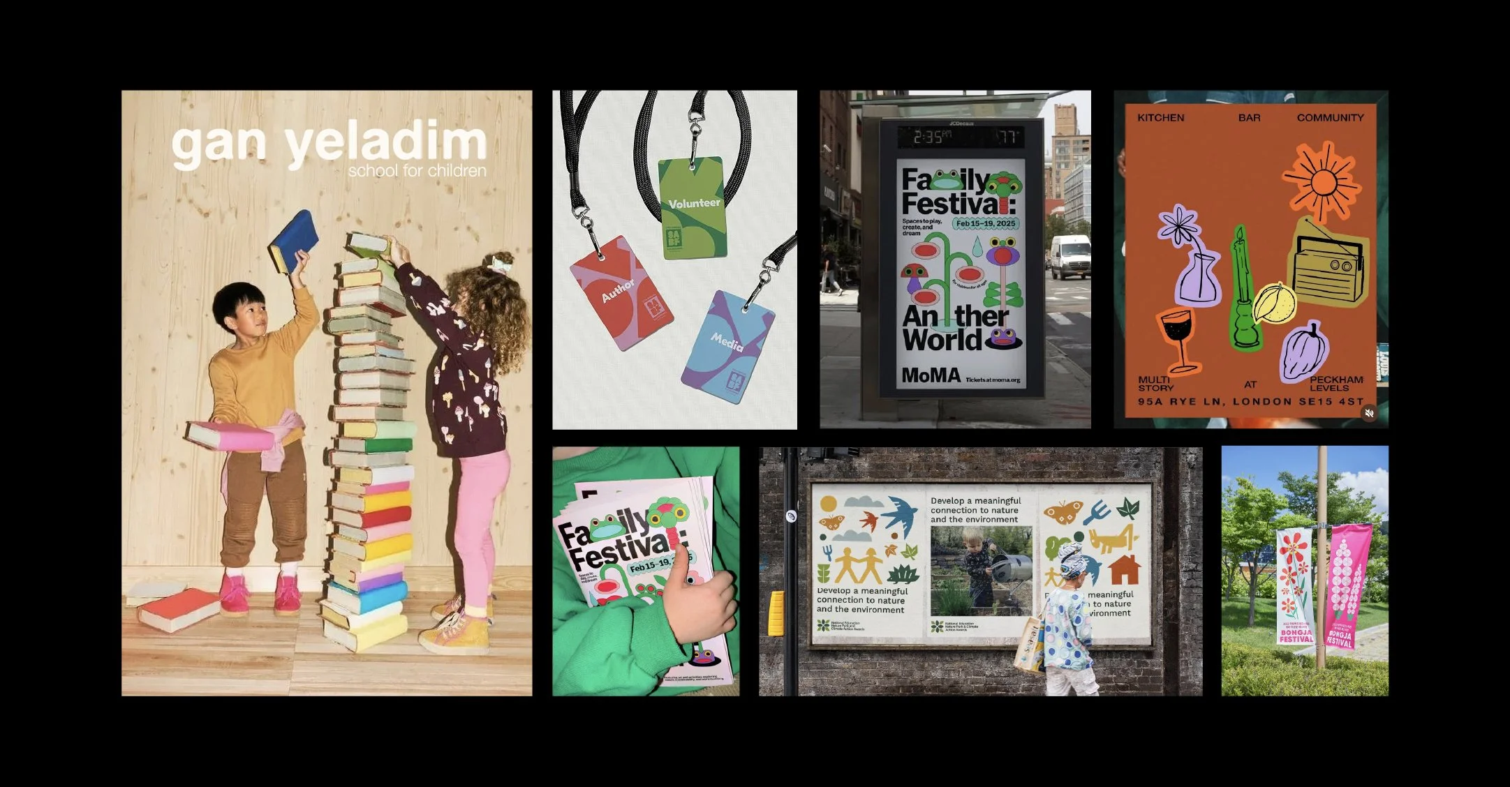
The mood board showcases inspirational visual components emphasizing bold colors and balancing a series of structured yet playful design compositions.
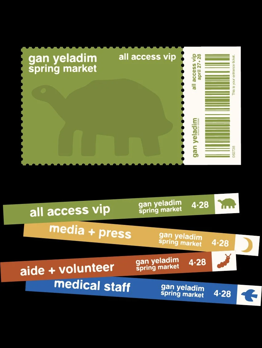
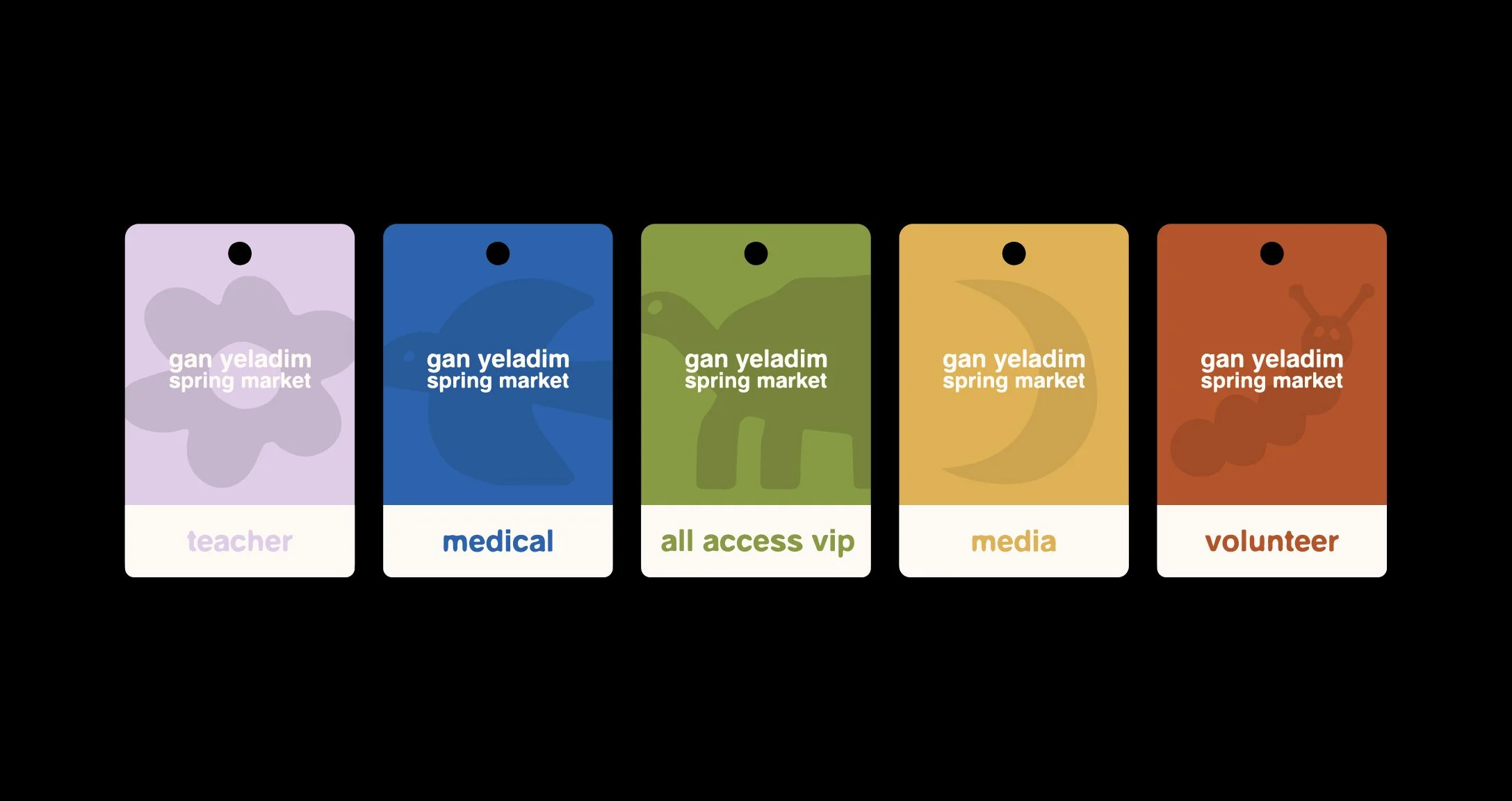
Event tickets, wristbands and identification badge designs play on the brand’s standards, coordinating groups via specific colors and illustrations.
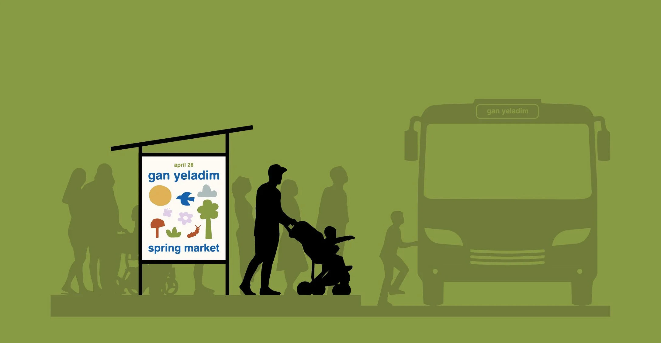
Transit shelters and pole banner out of home placements advertise an intimate scale in the community, capturing attention with colors and composition.

Merchandise for the spring market incorporates the brand’s colors and whimsical illustrations to the collection to feel youthful without being overly busy.
Directional signage and wayfinding provide guidance throughout the event spaces, with color coordination and simple typography easily orienting team members and guests.